Using Data Visualisations in E-Learning – the Benefits and Top Tips
One of the main goals when creating e-learning courses is to make the information as easy to understand as possible. It is also important to make your course as engaging as possible. There are various ways you can do this, from including scenarios to making the course mobile-friendly to clearing out clutter so learners can get through the content without distraction.
What happens when the course involves presenting data to learners, particularly complex data? You could use spreadsheets and tables. However, in most cases, that won’t be enough to qualify as being engaging and easy to understand. The same applies to using text to explain the data.
Data visualisations are the solution. Adding data visuals will enrich your content and allow you to present stats, facts, and figures in a way that is interesting.
What is Data Visualisation?
Data visualisation involves converting data into a format that can be easily understood and digested. Often this means being able to understand the data within a few seconds.
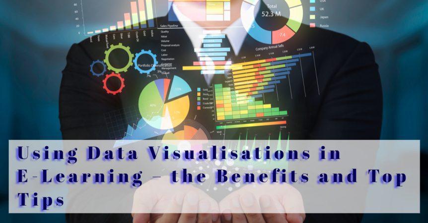
This data could be statistics, financial information, or any other type of data. Common visual formats for presenting data include charts, graphics, maps, and infographics.
How Data Visualisation Benefits E-Learning
Adding data visualisations elements to your e-learning courses benefits those completing the course and your organisation. Here are some of the main advantages.
- Helps learners understand and explore complex datasets. With a data visual, learners can see trends and patterns that exist in the data. Data visuals can also help them understand the impact of what they are learning.
- Data visuals help with storytelling in your e-learning course. Storytelling is an important part of making e-learning courses as engaging and interesting as possible. It can be difficult to tell a story with data, though, but data visualisation techniques make it easier.
- You can include data visuals as an interactive element of the e-learning course where, for example, the data is central to a gamified section.
- Adding data visuals helps to prevent cognitive overload. Cognitive overload is where learners are presented with more information within a timeframe than they can process. Data visualisations make it possible to present complex information in a way that is quick and easy to read.
- Data visuals speed up the learning process, enhancing the learner experience and making your e-learning courses more successful. Data visuals do this because most people are visual learners. Furthermore, we process visuals faster than we process text. So, instead of the learner reading paragraph after paragraph to understand the data, they can get what they need quickly from a data visual.
- You can use data visuals to reinforce key points in the e-learning course. For example, you might have a key statistic that is included in text or a voiceover in a video. Presenting this statistic again as a data visualisation helps to reinforce it in the minds of learners.
Types of Visuals that Are Effective in E-Learning
There are multiple ways of presenting data in a visual format. Some of the most common data visuals in e-learning include:
- Flow charts – common uses for flow charts include organisational diagrams, step-by-step guides, sequences, and processes. An alternative to a flow chart is a cycle diagram. Cycle diagrams can be used when the process is circular, such as the lifecycle of a product.
- Graphs and charts – there are various formats you can use when creating a graph or chart, but the most common are bar graphs, line graphs, and pie charts. Graphs and charts are excellent for showing the relationship between data. Pie charts are best for showing percentages and how much each element relates to the whole. Bar graphs can be used to compare quantities, while line graphs are ideal for showing changes over time.
- Timelines – timelines are used to provide a visual representation of past events. They give learners an immediate impression of the historical structure and relationships between events.
- Infographics – infographics are a large type of data visualisation featuring multiple elements. This can include data, text, and visuals within visuals. They are a good way of presenting larger topic areas in one visualisation.
Tips for Using Data Visualisations in Your E-Learning Courses
- Use fonts and colour palettes that reflect your brand identity and resonate with learners.
- Don’t use too many data visualisations as too many can be as detrimental as too few. It is better to have a balance between various methods of presenting information, including text, data visuals, images, video, etc.
- Make sure your data visuals are easy to understand. For example, in a bar or line chart, make sure you include clear definitions for the X and Y-axis.
- Consider how the visual will look on small screens, including mobile phones.
- Make sure the terminology you use is consistent.
- Text can be an important part of a data visualisation, so use text where it makes sense to do so, i.e., where it will help the learner understand what you are presenting them with.
Data Visualisations and the Learning Experience
Data visualisations enhance the appearance of your e-learning course, but they shouldn’t be included only for aesthetic purposes. They are at their most powerful when they are used to help learners get a deeper understanding of the topic.
When used in this way, they can be a powerful addition to your e-learning course, enhancing the learner experience, improving understanding, and increasing knowledge retention rates.