Why Responsive E-Learning Course Design Is Crucial
Have you ever visited a website using a mobile device that was difficult to read, or where you couldn’t use some of the functionality? While it’s annoying, it’s a situation that is becoming increasingly rare as more and more website owners realise the importance of responsive design. E-learning has got a bit of catching up to do as, from my point of view, responsive design is just as important in e-learning.
The main reason is that it delivers a better return on investment. There are multiple factors for why this is the case including:
- Learners will engage with the course more enthusiastically
- You will have a greater chance of achieving your objectives if the course has a responsive design
We’ll delve into the reasons for this below in more detail, but first a bit about responsive design.
What is Responsive E-Learning Course Design?
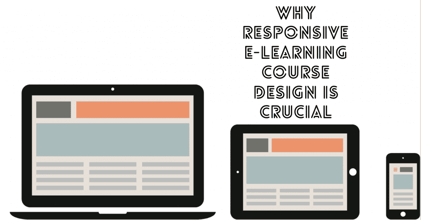
If you already know about responsive website design, you will have a good understanding of responsive e-learning course design. Essentially, it’s about making your course look good and function properly on all devices.
When considering this topic, you have three main options for your e-learning course:
- Design the course for a single type of device
- Design multiple versions of the course so it works on different types of device
- Use responsive design
With responsive design, the content of your course dynamically changes to properly fit the size of screen used by the learner.
In addition, responsive design involves using technology (such as HTML5) that ensures the course not only looks good on all devices, but also that all the features and functions work. This is important as devices, operating systems, and platforms work differently as well as having different sizes of screen.
So, when a learner accesses your e-learning course on the device they choose, the course dynamically alters to fill the screen and display properly. In addition, everything works.
Benefits of Responsive Design
- Appearance – if you don’t use a responsive e-learning course design, many of your learners will have to zoom and/or scroll horizontally to read the content. This is an awful learner experience and causes frustration. It can also put learners off completely.
- Functionality – responsive design also ensures all functions work properly. This can be everything from ensuring videos play to optimising navigation. For example, mouse hovers on navigation items look cool on desktop devices but they don’t work well on mobile phones where the learner uses a finger rather than a mouse.
- Choice – learners can use whatever device they want which makes it easier for them to complete modules and, ultimately, the course. They will usually also complete the course quicker as there is less need for them to make time to get in front of the right device.
- Easier to update – creating multiple versions of the e-learning course delivers all the above benefits, but it falls down on this one. Creating multiple versions of the course means it will work on most learner devices, but it also means you have multiple versions of the course. This makes it harder, more time-consuming, and costlier to update the course at a later date as you must update each version individually.
- Lowers costs – using a responsive design can lower the cost of your e-learning course in multiple ways. For example, you can reduce the cost of design as you don’t need to make multiple versions of the course to ensure it works on the devices your learners use. Also, you don’t have to purchase devices for learners as they can use their own phones or tablets. Updating a responsively designed course is cheaper than the alternative options too.
- Learning techniques – using a responsive design also lets you use effective learning techniques, such as micro-learning.
- More appealing – learners from all backgrounds and in all industries in the UAE and beyond increasingly use mobile phone and tablet devices for day-to-day activities. They do this to stay in touch with friends, colleagues, and family but they also use mobile devices for work, banking, and other tasks that used to be the preserve of the desktop. By making your e-learning course responsive, you’ll appeal to the modern the learner.
- Better results – all the above benefits culminate in improved rates of course completion and higher interaction. These are likely to be some of the objectives of your e-learning course.
You’ll probably need specialist help to develop a fully responsive e-learning course that takes into account design and functionality. The end result will be much higher quality than any alternative, so it’s undoubtedly the best approach to take.